Friday, 11 June 2021

June, Meeting in the Park

It was so wonderful to meet again in person!  Lovely to see all of you and admire your work.

Jeanette has sent along pictures of the day.


Christine

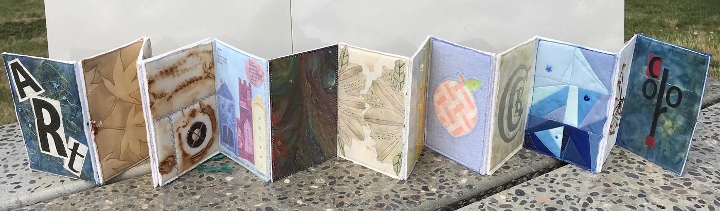
The accordion book Christine made from all the techniques shared over the winter.


Sandie

The accordion book


Bird house made in a Blind Challenge for the group in Armstrong.


Elisabeth

The accordion book


Cathy
 

The accordion book


Linda

A selection of notebooks Linda has been making and will be doing a demo on next month.


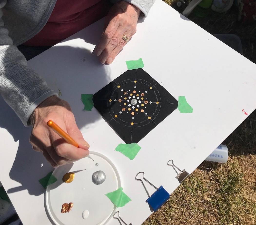
Then we played with paint and fabric and tried our hands at Mandala Dotting.


Linda


Judith


Cathy


Sandie


Christine


Cath


Saturday, 15 May 2021

May 2021

 A Few Finished Projects


Cathy


Here is a picture of my baby texture book for my new grandchild.  The fabrics used are satin, sequins, flannel, terry cloth, feathers, leather, minky, wool and vinyl.


Cath


Five years ago I made a small flower bouquet quilt in memory of my Dad, who passed away in 2011.  The black and white music note fabric is from a night shirt I made him in his last year.  The blue inner border is the ribbon colour for prostate cancer.

I made it in the style of Yvonne Porcella, a wonderful and colourful quilt artist and one of the founders of SAQA.


As I was working on making flowers from the varied techniques presented this year I thought of putting them together into another flower bouquet quilt in memory of my Mom.

My mother, Audrey, was 97 when she passed away in December 2020.  She had been struggling with dementia for many years, and in spite of fading mentally she was quite healthy.  But Covid 19 was just more than she could fight.

The thin purple border is the ribbon colour for dementia.  


Sunday, 11 April 2021

April


Neutral Colours


What is a neutral colour?

Neutral colours are most clearly defined as hues that appear to be without colour, and don’t typically appear on the colour wheel.  Neutral colours do not compete with primary and secondary colours .  They compliment them.


Why use neutrals?

They help other fabrics to stand out.  They can make a vibrant, wild palette look soft and airy, or add depth and dimension with out adding colour.  They can round out a palette making it look more complete and dynamic.


How to start?

Begin by paying attention to the undertones of the neutrals.


Undertones?

Beiges are the warm neutrals and generally go well with warm colours and earth tones.  Beiges will have pink, green, or yellow undertones.


Grays range from light, hazy gray to rich charcoals.  These cool neutrals come to life with vibrant, clear colours.  They will have violet, blue or green undertones.


Taupe is a combination of gray and beige, leaning toward gray, and can be both cool and warm. They will have pink or violet undertones.


Be deliberate with Value

If you want a serene, soft, elegant or understated look, use whites, creams, taupes and light grays.


For a more dramatic, bold, moody or attention grabbing quilt use more blacks, dark browns or charcoals.


Add harmony by choosing a warm neutral for a mostly warm palette, or cool neutral for a cool palette.


Create balance by adding a warm neutral to a cooler palette, or a cool neutral to a mostly warm palette.


At our upcoming meeting I will share with you two ‘Boho’ embellishments I came across during a stroll through You Tube.


I will have samples for you to see and explain some of the changes I made to the processes.  These changes came about because I didn’t have the materials suggested, or didn’t want to follow instructions! 


Chrissie Crosser, You Tube “How I make my Boho Beads” (22:16 minutes)   Chrissie uses a paper straw as the foundation of her bead.  She then uses a method to anchor the wire that the rest of the bead is built on.  I wasn’t comfortable with her method, and will describe some of the changes I made.  No doubt you will have modifications once you view the You Tube tutorial…or once you have made your own bead.  My granddaughters and I made a few beads together…its an easy and enjoyable process! 


https://www.youtube.com/watch?v=YHCVyYuO_rQ


Nina Ribena, You Tube “Boho Gypsy Tassel Tutorial Using Grandma’s Thimbles” (28:14 minutes)  I loved the sight of this tassel the moment I saw it. Again, another session with the granddaughters, and again, this was fun and easy too!  There are a variety of ways to embellish the tassel…watch the video and come up with a few suggestions for our meeting next Tuesday!


https://www.youtube.com/watch?v=k8ndbxumAxA


Cathy


Cathy has done some lovely flower embroidery and made a large tassel than hangs on her bedroom wardrobe.


Embroidered Wild Flowers by Kazuko Aoki


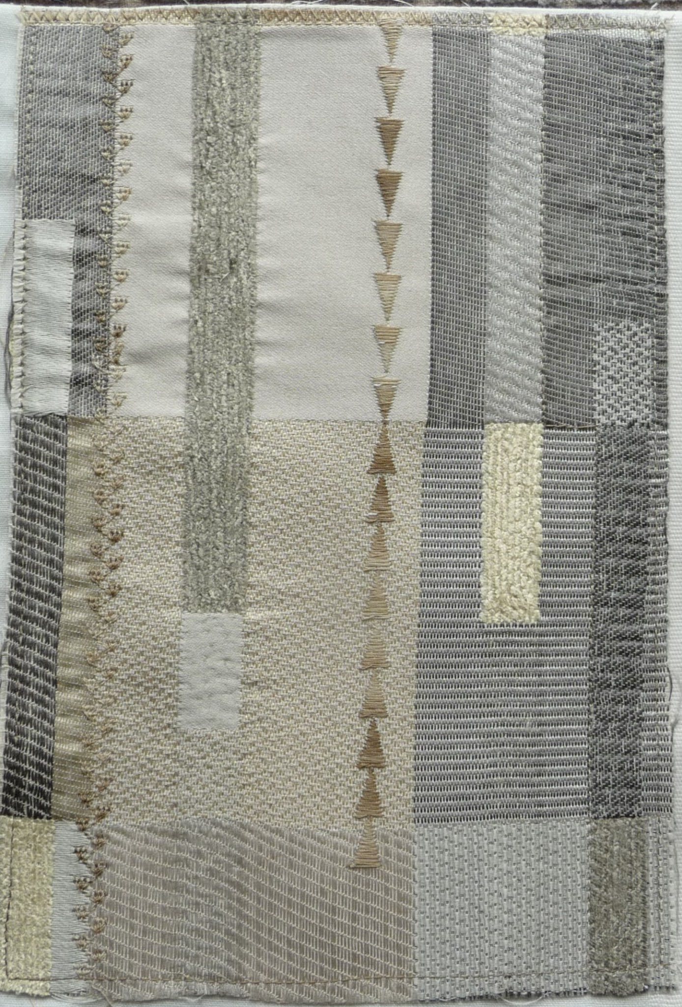
Cathy used some of our previous dyeing adventure fabrics in this neutral diamond, dyed with coffee, tea, rust and maybe avocado?


This beautiful piece was inspired by string art Cathy saw recently.  You remember the ones made with wood, nails and string?  Well, you can certainly do it with fabric, beads and thread!


Linda has been busy making a bunch of books and played around with decorating playing cards.


She has also been eco dyeing yarn, this one with marigold.  A very yummy yellow!


Sandie

A little inspiration from Sandie, with this picture of her 12 almost completed accordion book pages.


Elisabeth


Christine


Tuesday, 2 March 2021

March

A Small Part of the History of Blue

                                   Photo: This is the Color of My Dreams 

                                                                                 Joan Miro, 1925


There was very little blue in the ancient world.  It took all cultures a very long time to name the colour. None of the ancient languages had a proper word for blue.  In modern European languages the origin of the word blue comes from the Middle English 'bleu' or 'blewe', these are related to the Old High German word 'blao', meaning shimmering or lustrous. 

Today blue is considered the world's favourite colour.  We find many uses of it in our speech, blue book, blue collar, blue plate special, once in a blue moon, blue chip, and having the blues. The meanings vary greatly, some denote special or excellence and other times it is used as a slur or to cover a feeling of sadness.  Blue is the colour most commonly associated with harmony, faithfulness, confidence, distance, infinity, imagination, and cold.  It is also associated with intelligent, knowledge, calm and concentration.  

The Ancient Egyptians placed a high value on the colour blue.  They used lapis lazuli and azurite in their jewelry and artwork and set about producing a substance to reproduce the colour they adored.  From the time Egyptian Blue was first manufactured, about 2500 BC, it was used frequently in papyri, hieroglyphics on walls and as a glaze on funeral objects and decorated coffins.  In 2006, a scientist discovered that Egyptian blue glows under fluorescent light.  This has helped immensely in identifying the colour on ancient artifacts, even when you can't see it with the naked eye.  


Egyptian Blue 


The painters of the Renaissance coveted the pigment Ultramarine, made from lapis lazuli in an extremely labour intensive process, but it had a vibrancy like no other blue.  Called True Blue, lapis lazuli first appeared as a pigment in the 6th century.  It was renamed Ultramarine, meaning 'beyond the sea' in Latin, when first imported into Europe in the 14th and 15th centuries.  It was high sought after by artists but in order to use it you had to be wealthy, or have a wealthy benefactor, as it was considered to be as precious as gold.

Girl with a Pearl Earring by  Johannes Vermeer, 1665


The first synthetic blue pigment since the Egyptians was created in Germany by Heinrich Diesbach.  In trying to mix a different pigment called 'red lake', Diesbach used a contaminated potash and created a new blue called Prussian Blue.  Like ultramarine it was a vibrant blue, didn't fade, but could be made for a fraction of the price.  Katsushika Hokusai used it in his iconic 'The Great Wave off Kanagawa.     In 1842 it was discovered that Prussian Blue had a unique sensitivity to light and was therefor perfect to create copies of drawings.  This is what led to the modern blueprint.


The Great Wave off Kanagawa                             Katsushika Hokusai  1831


Cobalt Blue dates to the 8th century and was used to colour ceramic and jewelry.  It was very popular in China and used in the distinctive blue and white patterned porcelain.  A French chemist created and alumina based version that was quickly in commercial production and used by painters, such as Renoir and Van Gogh, as an alternative to the expensive ultramarine.

The brighter blue swirling sky and the area surrounding the moon are predominantly Cobalt Blue.


The Starry Night    Vincent Van Gogh 1889                                                                             


The process of making indigo seems to have been discovered independently and at different times around the world.  The arrival of the new blue dye called 'indigo' shook up the European textile trade in the 16th century.  There are many different species of plants that produce indigo but the most popular is 'indigofera tinctoria'. The process of extracting the dye from the leaves is difficult even with modern chemicals and equipment.  It is worthwhile though to achieve the vivid colour and it ages beautifully as all of us denim wearers know.  From being a luxury, indigo has become the colour of the 'blue collar' workforce world wide.  This has proved to be the pigment's most lasting legacy in the form of blue jeans.  Said to have peaked in 2006, the global denim industry, which is dominated by the classic indigo blue, was worth $54 billion in 2011.

                                       Artist Ian Berry uses denim exclusively in his artwork.


The Game


#iclapfor


For more information on Blue, and gold and white check out:

The History of Art in Three Colours with Dr. James Fox on YouTube.

https://www.youtube.com/watch?v=peh1_VEtzP8

All the episodes were great but Blue was my favourite!

An excellent site on the meaning of colours

https://www.bourncreative.com/meaning-of-the-color-blue/

Reference books:

The Secret Lives of Colour by Kassia St.Clair

The Secret Language of Colour by Joann Eckstut and Arielle Eckstut


Jeanette

Jeanette is working on a bird for each colour.  Here is her progress so far.  


Cathy


The one on the left is paper pieced. The one on the right is a back of a quilt I made about fifteen years ago which was embroidered by one of our guild members with ‘blue words’.


Cath

I used Jeanette's idea of the thread work circles and made a Blue Moon from it.  Had fun with my stitch regulator on the free motion part.  There is some metallic and some sliver in the long rays.  


Christine

A river runs through Christine's piece.  


Elisabeth


August

 We were back at our usual location this month and the wildfire smoke is letting up a little more.  Our thoughts are with everyone who is ex...