Wednesday, 16 May 2018

Hands On Encrusting

This month to follow on with our study of Texture, the group focussed on Encrusting.  To get started, Christine T. provided a stimulating JOLTZ exercise consisting of a circle divided into pie shapes.  Each participant was asked to fill in one pie segment within an allotted time (2 minutes) and then pass their "pie circle" onto their neighbour.  With each successive addition, we were asked to make sure that our additions connected to the one previous.  Sounds complicated?  Well here is what was generated.


Our apologies for the quality of the pictures, but pencil markings were difficult to capture.  You can however see that an interesting array of mandalas were created.

Cathy G-B followed this up with a detailed discussion about Encrusted.  Definition?  Cathy provided several:

  1. Cover (something) with a hard surface layer
  2. Form a crust
  3. Covered with something hard or decorative
  4. To decorate by inlaying or overlaying with a contrasting material

This last definition suited our purposes well.  Cathy had asked our members to consider a theme and  bring various items that would reflect our chosen theme along with two pieces of fabric within which to envelope our articles.  For example, a theme of seashore could include sea shells, pebbles, etc.; a theme of hardware could include bolts, screws, washers, etc.

Here is Cathy giving a demonstration of the various stitches that were used to encrust our various objects.
After some preliminary stitching, the group got to work trying out the various stitches that will be used in creating their encrusted pieces.
Some of the stitches used were:

  1. French Knot
  2. Colonial Knot
  3. Scroll Stitch
  4. Seed Stitch
  5. Bullion Knot
  6. Raised Cup Stitch

There are many others that can be used to decorate, but these were the basics.  If you are interested in exploring more stitches, there are several good websites that provide excellent tutorials.  Pintangle is one such website that has an excellent Stitch Dictionary.  Mary Corbet's Needle 'n Thread site has some excellent video tutorials.

Have fun exploring and we look forward to seeing what your encrusted pieces look like.

Friday, 27 April 2018

You Can Grow It?

At our last meeting, Jeanette produced an item that looked like leather from a distance, felt like those fruit roll-ups that kids use for a snack, but it turned out to be fabric.  Fabric that she had grown.  Yup!  You heard right.  You can grow fabric!  Hold on to your hats textile artists!!

Apparently using a brew of Kombucha culture known as Scoby, some plastic containers, heat and a dark place, you can grow a microbial fabric that has a texture varying from leather to papyrus.  Although it's tensile strength is strong, it has however one drawback; it's not waterproof or water resistant.

If you want to start your own "fabric laboratory"  here are some sites you may wish to visit to find out more.

https://www.thekitchn.com/how-to-make-your-own-kombucha-scoby-cooking-lessons-from-the-kitchn-202596

http://www.instructables.com/id/Kombucha-Fabric/

https://jennyy.com/what-next/

Sunday, 15 April 2018

Studying Texture and Encrusting

It's been a while since we have had additional information to post.  This past meeting, we enjoyed a stimulating creative exercise called " 30 circles" derived from UK Ed Chat.

We also began our study of texture and encrusting as it relates to visual art.  Mary, Elizabeth and Kay entertained us with information about the topic and provided a number of samples.  Here is what they discovered.

There are two styles of texture; visual and tactile.  So what does that mean in relation to our fibre art?

Tactile:  Is the fabric smooth like silk, or ribbed like corduroy?  This  can also include the weave of the fabric, the beading on it, or the stitching and any dimensional additions. 

Visual:  There is no actual texture on the surface, but rather gives the appearance of texture where no difference to the surface can be felt; e.g. a fabric printed with bark, droplets of water, or cracked concrete.

Here are some samples that Mary, Elizabeth and Kay produced for our group.  In this picture you can see the various different fabric textures that were used to create a tactile surface.


The postcard here has been stitched with fabric that has then been cut to create a chenille effect.

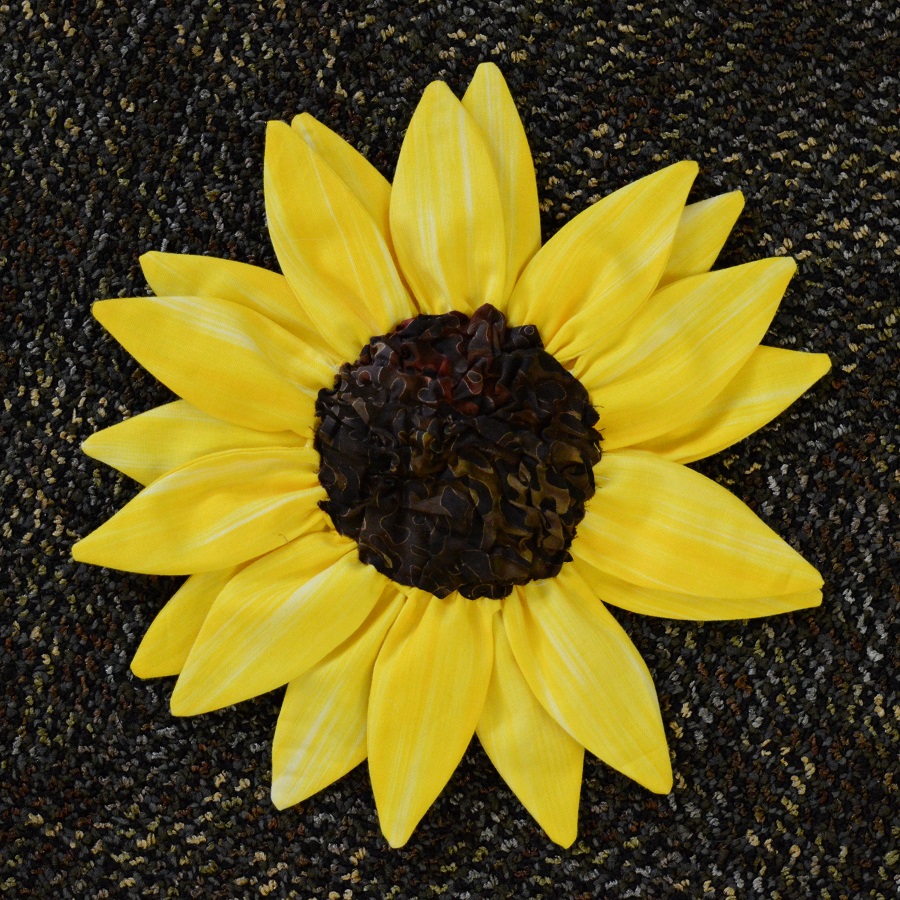
Another example showed the use of fabric texture created with a cooling rack to achieve a "nubbly" effect, which is used in the centre of the sunflower.  Texture Magic is a product that will also produce this effect.


In this example the horns of the figure are couched and the background is raw edge fabric stitched in place to create texture.

Consider using your twin needle to create texture as shown in this example.  Notice the ridges created by the stitching of the twin needle

Cathy provided an example of encrusting, another form of creating texture in our fibre art.  If an object is encrusted it is covered or overlaid with a coating or hard covering.  In our case, those coverings can include cheesecloth, cotton, organdy, organza, netting, or tulle.

On close inspection you can see buttons encrusted between fabric and stitched in place; cheesecloth encrusts additional little pieces.
A detail of the encrusted piece.
Ann Johnston in her book The Quilter's Book of Design writes; "Quilters have the advantage of being able to choose from a whole range of fabrics, embellishments, and quilting and construction techniques to achieve a wide variety of textures.  A hundred years ago quilters were taking advantage of fancy fabrics, embroidery stitches, paint, lace and ribbons.  We have even more options today."

Consider how couching, buttons, and puff paint might add to the texture of your textile piece.

Till the next time, happy stitching and creating.

Friday, 12 January 2018

2018 Challenge - Water

Our member, Cathy, while on a world trip, brought back several yards of fabric.  That yardage was cut up, put into packages and presented to our group.  Along with studying various topics this year, we have been challenged to create a fibre art piece that reflects the theme of WATER.

Here is a picture of the fabric that we were given.
The lower left fabric is a tri-colour cotton from New Zealand.  The multi-coloured one sitting on top of the others is a linen that was hand stamped from South Africa.  That lovely emerald green is a shot silk from Hong Kong and the final blue fabric in the upper left is a silk paisley from India.

All of the fabrics were purchased in countries that are bordered by an ocean, hence the theme:  WATER.

Were there any other restrictions you may ask.  Just one: the quilts created are to be no larger than 150 inches in perimeter.  We can if we choose add value and contrast with other fabrics, or NOT.  That decision is optional.  Let's see what the group creates.  You'll have to check here in late summer to see some of the results.

Are you Illuminating?

We just finished our monthly meeting and this time the topic to be covered was Illumination.  With the help of Brigitte and Sandie we were presented with some ideas and techniques to consider.

Sandie started us off with a excersize we call JOLTZ.  It's purpose is to jolt us out of our comfort zone and get us thinking and or working outside the box.  The exercise involved rolling dice and then drawing a portion of a "Picaso-esque" face  with each roll of the dice.  The results were amazing.

After giving credit to Wikipedia for help with research, Brigitte presented what she had discovered about  illumination.  What follows is some of what she presented.  After the presentation, the group was challenged to produce a fiber art piece illuminating their impression of what they had learned.  The results will be shown in a later post.

There are many ways to define the term illumination.  Very basically it refers to the falling of light onto objects and making them visible as they are illuminated.  But there are other definitions that we might consider in our study.

Wikipedia states that Illumination, an observable property and effect of light, may also refer to:

  • the use of light sources - Lighting
  • the use of light and shadow in art - Illumination (image)
  • The artistic decoration of hand-written texts - Illuminated manuscript.
In the study of physics there is an additional definition, but that is not our study here.  To narrow our study of this term, we shall focus on lighting and the art of decorating a text, or initial letter.

Lighting

The illumination of the subject of a drawing or painting is a key element in creating an artistic piece, and the interplay of light and shadow is a valuable method in the artist's toolbox.  The placement of the light sources can make a considerable difference in the type of message that is being presented.  Multiple light sources can wash out any wrinkles in a person's face, for instance, and give a more youthful appearance.  In contrast, a single light source, such as harsh daylight, can serve to highlight any texture or interesting features.
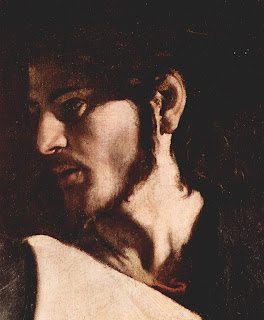
By using light/dark contrast one can illuminate an object so as to give it form or shape making it look more realistic.  The use of dark subjects dramatically lit by a shaft of light from a single constricted and often unseen source was a compositional device developed by Ugo da Carpi in the mid-15th century.

Developed during the Renaissance, chiaroscuro (light-dark) is an oil painting technique that uses strong contrasts between light and dark to create a dramatic effect.  Artists known for developing the technique include Leonardo da Vinci, Caravaggio and Rembrandt.

Chiaroscuro originated as drawing on coloured paper, where the artist worked fromt he paper's base tone toward light using white gouache, and toward dark using ink or watercolour.  These in trun drew on traditions in illuminated manuscripts.  Such works used to be called "chiaroscuro drawings".  The term broadened in meaning early on to cover all strong contrasts in illumination between light and dark areas in art, which is now the primary meaning.


It is a mainstay of black and white and low-key photography.

Illuminated Manuscripts

An illuminated manuscript is a manuscript in which the text is supplemented with such decoration as initials, borders (marginalia) and miniature illustrations.  In the strictest definition, the term refers only to manuscripts decorated with gold or silver.  However the common usage today refers to any decorated or illustrated manuscript from Western traditions.

The earliest surviving illuminated manuscripts are from the period 400 to 600, produced in the Kingdom of the Ostrogoths and the Eastern Roman Empire.  Illumination of manuscripts was a way of aggrandizing ancient documents, aided their preservation and informative value in an era when new ruling classes were no longer literate, at least in the language used in the manuscripts.

The majority of surviving manuscripts are from the Middle Ages, although many survive from the Renaissance.  The majority of these manuscripts are of a religious nature.  However especially from the 13th century onward, an increasing number of illuminated manuscripts were secular texts.  Most medieval manuscripts important enough to illuminate were written on the best quality of parchment, call vellum.

Illuminated manuscripts continued to be produced in the early 16th century, but in much smaller numbers, mostly for the very wealthy.  Manuscripts are among the most common items to survive from the Middle Ages as also the best surviving specimens of medieval painting.

Art historians classify illuminated manuscripts into their historic periods and types, including (but not limited to Late Antique, Insular, Carolingian manuscripts, Ottonian manuscripts, Romanesque manuscripts, Gothic manuscripts and Renaissance manuscripts.

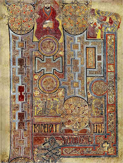
The type of book that was most often heavily and richly illuminated, sometimes known as a "display book" varied between periods.  In the first millennium, these were most likely to be Gospel Books, such as Lindisfarne Gospels and the Book of Kells.
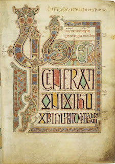
Folio 27r from the Lindisfarne Gospels contains the incipit from the Gospel of Matthew.
The Book of Kells, (folio 292r), circa 800, showing the lavishly decorated text that opens the Gospel of John
The romanesque period saw the creation of many huge illuminated complete Bibles - one in Sweden requires three librarians to lift it.

Finally the Book of Hours, very commonly the personal devotional book of a wealthy lay person, was often richly illuminated in the Gothic period.  They Byzantine world also continued to produce manuscripts in its own style, versions of which spread to other Orthodox and Eastern Christian areas.

Wealthy people began to build up personal libraries; Philip the Bold probably had the largest personal library of his time in the  mid-15th century; it is estimated to have had about 600 illuminated manuscripts, whilst a number of his friends and relations had several dozen.

Tuesday, 2 January 2018

It's all a matter of Perspective

Our first topic of focus this year is Perspective.  Our member Jeanette took the time to explain various aspects of perspective and provided several visual examples.  Here is some of what was presented.

History

The rules of perspective as we know them today developed during the Renaissance in Florence, Italy in the early 1400s.  Prior to this time paintings were not expected to be realistic of naturalistic representations of life.  Instead paintings were stylized and symbolic.  For instance, the size of a figure in a painting might indicate their importance, rather than their proximity to the viewer, and individual colors carried significance and meaning beyond their actual hue.

What is perspective?

The definition of perspective can be given as "the art of drawing solid objects on a two-dimensional surface so as to give the right impression of their height, width, depth, and position in relation to each other when viewed from a particular point." Rather wordy, but put more simply, perspective drawing gives a three-dimensional feeling to a picture.  It's a system of representing the way objects appear to get smaller and closer together the further away they are in a scene.  It is one of the fundamentals in art you need to understand in order to create realistic and believable scenes.


Vanishing Point

A key element in many works of art is what is known as a vanishing point, or point of convergence.  Here are a couple of visual examples.
A vanishing point can be seen at the far end of this railroad (Source, Wikipedia)
The road lines vanish off into the distant horizon.
The vanishing point is the spot on the horizon line to which the receding parallel lines diminish.  It is what allows us to create drawings, paintings, and photographs that have a three-dimensional look.  

The easiest way to illustrate this in real life is to stand in the middle of a straight road. When you do this, you'll notice how the sides of the road and the lines painted on it meet in one spot on the horizon. The center line will go straight for it and the lines on the side will angle in until all of them intersect. That point of intersection is the vanishing point.  

The vanishing point may be inside or outside the actual landscape scene.

Jeanette's presentation went on to describe the various types of linear perspective; one-point, two-point and three-point.  The one/two/three refers to the number of vanishing points used to create the perspective illusion. Two-point perspective is the most commonly used.

Aerial or Atmospheric Perspective

Aerial or atmospheric perspective is another type of perspective that causes things in the distance to appear to have a lighter value and a cooler hue than things in the foreground.  Atmospheric perspective is not linear perspective.  Rather, it attempts to use control of focus, shading, contrast, and detail to duplicate the visual effect of near objects being crisp and clear.  At the same time, distant objects may be less distinct and muted.  ArtHints.com gives a good explanation and some visual examples of atmospheric perspective here.

Another example of aerial or atmospheric perspective is a mountain range in which the mountains in the distance appear lighter in value and a bit cooler, or bluer, in hue.  Because of the increased layers of atmosphere between the viewer and objects in the distance, objects that are further away also appear to have softer edges and fewer details.


Foreshortening Perspective
Foreshortening is yet another type of perspective that makes something appear as though it is receding strongly into the distance by compressing or shortening the length of the object.  There are several good videos online to show the technique.  Here is a link to a video about creating this technique.  This link here also has a good illustration of the impacts of foreshortening.  One of the better examples and explanations of foreshortening can be found here at this site for the Khan Academy.

Additional Research

http://everyonecandraw.net/Perspective/

https://www.studentartguide.com/articles/one-point-perspective-drawing

The group was then challenged to take photos of examples of the various types of perspective and attempt to use textiles and fibre to portray what we had learned. 


What's up for 2017/18 year

We're a little late posting to our blog this year, but we're here now.

Last year we completed a project using various techniques to represent our interpretation of Canada's 150th year.  Here are some of the completed pieces.


If you click on the tab above marked "Canada 150 Project" you can read the artist statements for each of the pieces.

As for this year, here is what we have planned for this year.

Our first meeting took place in September and the group decided where their focus would be from a long list of various topics.  The result: we will be delving into the topics of Perspective, Illumination, and Texture/Encrusted.  We will be focusing on each topic through presentation, an outing to find and record physical examples in our environment, and a meeting to attempt to create an individual fibre piece demonstrating what we have learned.

Stay tuned and hope you come along for the journey.

September, the start of a new year!

Welcome back to all returning and new members!    "Art enables us to find ourselves and lose ourselves at the same time." Thomas M...